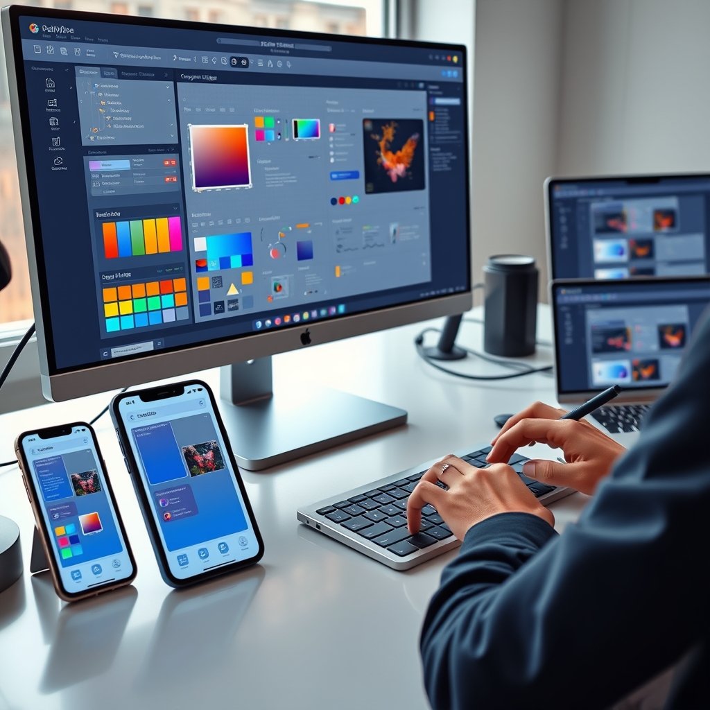
In 2026, users expect to move effortlessly between their smartphone, tablet, laptop, and even emerging devices without any disruption. They want the same familiar feel, fast performance, and intuitive navigation no matter which screen they are on. Delivering seamless cross-platform experiences has become a must-have for any brand that wants to build loyalty, reduce frustration, and drive higher engagement.
Businesses that fail to create consistent experiences across web, mobile, and desktop lose users quickly. At Ultimate Website Designs, we specialize in building unified digital ecosystems that feel native on every platform while staying true to your brand identity. A well-executed cross-platform strategy turns casual visitors into loyal customers by removing friction and creating delight at every touchpoint.
Seamless cross-platform experiences are no longer optional — they are the foundation of successful user-centric products in today’s multi-device world.
The Core Philosophy Behind Unified Cross-Platform Design
Great cross-platform UI/UX starts with a fundamental mindset shift: move from “mobile-first” or “desktop-first” to a true user-first philosophy. Users don’t think in terms of devices — they think in terms of tasks and goals. Their journey is continuous, and the interface should simply get out of the way.
Consistency builds trust. When colors, typography, icons, buttons, and interaction patterns feel familiar across every platform, users spend less time learning and more time achieving their objectives. This reliability strengthens brand perception and encourages repeat engagement.
Building a Robust Design System for True Consistency
A strong design system acts as the single source of truth for your entire digital product. It includes reusable components, design tokens (colors, spacing, typography), icons, and detailed guidelines that ensure every screen speaks the same visual and functional language.
Key elements of an effective 2026 design system include:
- Cohesive color palettes with proper contrast ratios for accessibility
- Scalable typography systems that work across all screen sizes
- Consistent icon libraries optimized for retina and high-DPI displays
- Reusable UI components (buttons, forms, cards, navigation) built with accessibility in mind
A well-maintained design system speeds up development, reduces inconsistencies, and makes it much easier to maintain brand integrity whether you are launching a responsive website, a native mobile app, or a complex desktop dashboard.
Our UI UX Design and Development Services always begin with a solid design system to guarantee pixel-perfect consistency across platforms.
Responsive vs Adaptive Design: Choosing the Right Approach
Consistency does not mean identical replication. Each platform has unique strengths and constraints, so smart adaptation is essential.
Responsive design uses fluid grids, flexible images, and CSS media queries (including modern container queries) to let a single layout reflow naturally across screen sizes. It is efficient and future-friendly.
Adaptive design creates separate layouts optimized for specific device categories or breakpoints, delivering a more tailored experience on known screen types.
In 2026, the best solutions often combine both approaches. Start with a responsive foundation and layer in adaptive enhancements where they deliver clear user benefits.
Respecting Platform-Specific Patterns Without Losing Brand Identity
Users have strong expectations shaped by their operating system. iOS users expect swipe-from-left gestures for navigation, while Android users look for gesture navigation or a dedicated back button. Desktop users rely heavily on hover states, keyboard shortcuts, and precise mouse interactions.
The smartest strategy respects these native conventions while maintaining your unique brand voice. Use platform-specific components (such as native navigation patterns) inside a unified design framework. This makes the experience feel intuitive and “at home” on each device without sacrificing overall consistency.
Optimizing Interactions and Performance Across Devices
Seamless experiences go beyond visuals — they must feel responsive and delightful to use.
Key considerations for 2026 include:
- Larger touch targets (minimum 48×48 pixels) on mobile
- Proper hover and focus states for desktop and keyboard navigation
- Full support for voice input and trackpad gestures where relevant
- Strict adherence to Core Web Vitals — fast loading, smooth animations, and stable layouts
Performance matters on every platform. A sluggish interface frustrates users instantly, whether they are on a high-end desktop or a budget smartphone. Techniques like lazy loading, optimized images (including 120 DPI SVGs), and efficient code are non-negotiable.
Designing Consistent Yet Flexible Navigation
Navigation should give users a clear mental model that stays logical across platforms. The information hierarchy and primary user flows must remain predictable.
However, the visual presentation should adapt intelligently:
- Desktop → Sidebar menus or top navigation work well on large screens
- Mobile → Bottom tab bars or hamburger menus feel more natural
- Tablet → Hybrid approaches that blend both worlds
A flexible navigation system keeps the experience familiar while respecting each device’s ergonomics and screen real estate.
Rigorous Testing Across the Full Device Ecosystem
Never assume your design works perfectly everywhere. Comprehensive testing on real devices is essential to catch platform-specific issues that emulators miss.
Focus testing on:
- Smooth data synchronization when switching between mobile and desktop
- Transition moments between platforms
- Accessibility compliance (WCAG 2.2 Level AA) with screen readers and keyboard navigation
- Performance under different network conditions
Invest in device labs and cross-browser testing tools to ensure the illusion of a single, continuous experience remains intact.
Future-Proofing Your Cross-Platform Strategy for 2026 and Beyond
Technology evolves rapidly. Foldable phones, large-screen tablets, and new input methods continue to emerge. Build with scalability in mind by choosing modular frameworks and token-based design systems that can adapt without requiring a full redesign.
Prioritize progressive enhancement and accessible, standards-based code. This approach keeps your product ready for tomorrow’s devices while delivering excellent experiences today.
At Ultimate Website Designs, our Custom Website Design Services incorporate these future-proof principles to create digital products that remain relevant and delightful for years to come.
Start Creating Seamless Cross-Platform Experiences Today
Mastering cross-platform UI/UX is an ongoing practice of empathy, consistency, and intelligent adaptation. By grounding your work in a robust design system, respecting platform nuances, optimizing performance, and testing relentlessly with real users, you can build products that feel like a natural extension of your users’ intentions — no matter which device they choose.
The payoff is clear: higher engagement, stronger brand loyalty, and better business results.
Ready to deliver frictionless experiences across web, mobile, and desktop that keep users coming back? The expert team at Ultimate Website Designs specializes in creating unified, high-performance digital ecosystems tailored to your brand vision.
Contact us today to discuss how our UI UX Design and Development Services and Custom Website Design Services can help you build seamless cross-platform experiences that drive real growth in 2026 and beyond.
Frequently Asked Questions
What does seamless cross-platform experience mean? It means users enjoy a consistent, intuitive, and high-performing interface whether they are on a phone, tablet, laptop, or desktop. The journey feels continuous with minimal friction when switching devices.
What is the difference between responsive and adaptive design? Responsive design uses fluid grids that automatically adjust to any screen size. Adaptive design creates separate optimized layouts for specific device categories or breakpoints for a more tailored feel.
Why is a design system important for cross-platform UI/UX? A design system provides reusable components and guidelines that ensure visual and functional consistency across all platforms while speeding up development and maintaining brand integrity.
How important is performance in cross-platform experiences? Extremely important. Slow loading or stuttering interfaces frustrate users on any device. Optimizing for Core Web Vitals is essential for keeping users engaged across web, mobile, and desktop.
Should navigation change across platforms? Yes, the visual presentation of navigation should adapt to each device’s screen size and ergonomics (e.g., sidebar on desktop, bottom tabs on mobile), while the underlying information hierarchy stays consistent.
How can I test cross-platform experiences effectively? Test with real users on actual devices, not just emulators. Focus on data synchronization, transition moments, accessibility, and performance under real-world conditions.
How can Ultimate Website Designs help with cross-platform projects? We create unified design systems and build responsive, accessible, high-performance websites and applications that deliver seamless experiences across all devices while staying true to your brand.